We send reports on a daily/periodical basis for various requirements and reasons. Identifying the most relevant data for a report itself is an important task! Have you thought about it?
What is the point of preparing a report without a purpose!?
So, define the purpose first! Then understand the objective of your report. Identify the type of questions you are trying to solve or what decisions you are trying to take based on the report!
Once the objective is identified, then pen down key-metrics. Define which metrics are most important for your objective. These could be based on your business, task and the end goal! For example if the objective is related to sales, then you need look at the metrics like – total sales revenue, no. of units sold, avg. selling price, avg. sales by region, and sales growth rate. If you want to show the trends over the years, you look into parameters like CAGR (cumulative annual growth rate) etc.
Ok! Now you have defined your objective then identified the key-metrics! What next? Did you identify the audience who will be consuming this report? So tailor your data selection to your audience. Give a thought on what information will be most meaningful or actionable to these audience base. The top management especially CXO may want high-level summaries, the regional heads or functional heads will look the report from different angle and perspective while analysts may require more detailed data.
Here comes to the stage of reviewing the available data. What data is available with you in the database or system. What kind of data sources are available! This could include internal databases, surveys, industry reports, etc. Then drill down your data to include the parameters/variables which are directly relavant to your objective.
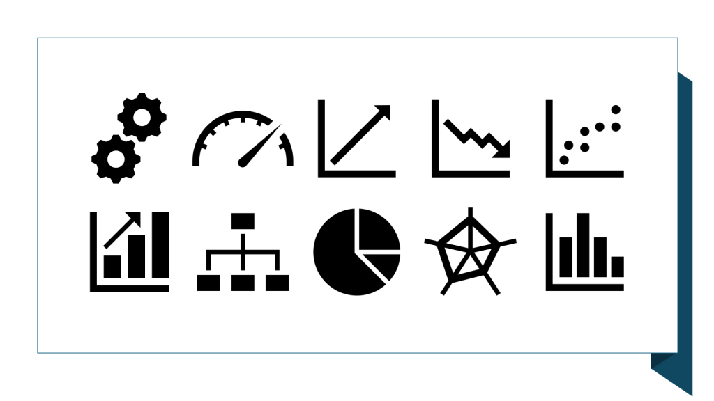
And then think of how best you can represent the data with different types visualizations. Some times you just need to visualize the relationships among the data points. The following are very useful techniques (irrespective of the type of tool used):
- Bar chart: One of the easiest charts to read that helps in comparison of categorical data. One axis contains categories and the other axis represents values.
- Column chart: Also known as a vertical bar chart, where the categories are placed on the x-axis. These are preferred over bar charts for short labels, date ranges, or negatives in values.
- Scatter plot: Most commonly used chart when observing the relationship between two variables. It is especially useful for a potential correlations between data points.
- Bubble charts: Often used to visualize data points with 3 dimensions, namely visualized on the x-axis, y-axis, and with the size of the bubble.
There are other types of data visualizations which allow you to show sub-categories within a large category:
- Pie chart: One of the most common ways to show part to whole data. It is also commonly used with percentages
- Donut pie chart: The donut pie chart is a variant of the pie chart, the difference being it has a hole in the center for readability
- Heat maps: Heatmaps are two-dimensional charts that use color shading to represent data trends
- Stacked column chart: Best to compare subcategories within categorical data. Can also be used to compare percentages
And the other types of data visualizations allow you to visualize the distribution of a variable. The below are some of them:
- Histograms: Shows the distribution of a variable. It converts numerical data into bins as columns. The x-axis shows the range, and the y-axis represents the frequency
- Box plot: Shows the distribution of a variable using 5 key summary statistics—minimum, first quartile, median, third quartile, and maximum
- Density plot: Visualizes a distribution by using smoothing to allow smoother distributions and better capture the distribution shape of the data
In a nutshell, line charts to shows trends in sales revenue over time, bar charts to compare sales performance across different regions, and pie charts to show the proportion of sales by product category. These visual representations can help you to highlight the key insights and trends.
And lastly, you need to ensure that the data you select is accurate, up-to-date, and reliable. Try not to use the data that is outdated or based on unreliable sources. And in the end review the data once more and make sure that it effectively supports your report’s objective.
